AEON

Overview
Challenge
Shopping for fresh groceries at AEON website became unreliable and frustratingly time-consuming due to its confusing interface and outdated technology. This hurts AEON's business as homemakers, or users, rather go for different grocers.
My Role
DISCOVERY
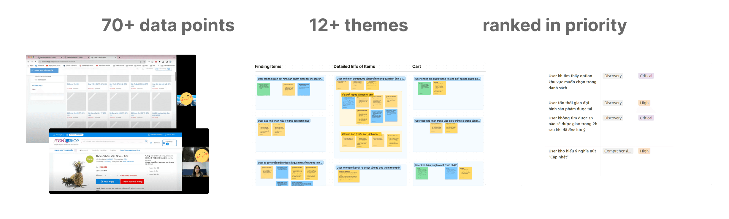
Methods: heuristic evaluation, usability testing (6 users), desk research
To fully understand the asks of AEON, our team gathered quick evidence on what was & was not working for AEON's website. We later sorted it by importance and only tackled high-ranked issues to ensure a functional purchasing flow for users.
Read Full Research Here
Insights
1
High-priority info like delivery policy, note to driver, …. were inconsistent and hidden that may be detrimental to the user's decision making.
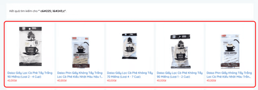
Ex 1: Return wrong search answer
(eg. coffee instead of fish)

Ex 2: Policies are hidden behind seemingly
non-clickable buttons
2
Participants were unaware of the AEON website until testing, preferring to shop on other grocers with cleaner UIs and unique offers.
Ex 1: Traditional browsing menu,
making users overwhelmed

Ex 2: Random, non-relevant ads
and deals for homemakers
Discussed themes became our primary focus because they fit our resources best while adding more values to users and stakeholders when solved. Many lower-ranking usability issues were noted and later resolved.
ideation & dESIGN
Design Goal
Solve high-impact pain points for users while offering AEON new features that will polish its place in the grocers' race in the long run.
Constraint
Cannot assume monetary gifts and highly advanced tech from AEON to be viable solutions.
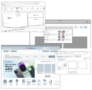
Iteratively improving wireframes & info architecture
Methods: research, rapid wireframing
While refining ideas sometimes met dead-ends, we all committed to daily collaboration for feedback & discussion.
Insights drawn from competitive analysis, desk research, and mentor feedback accelerated this phase.
Accelerating design process
With a tight deadline for high-fidelity designs and testing, strategic task delegation allowed us to cover multiple areas in parallel. As team lead, I quickly sorted through what needed to be done and assigned sensible tasks to each member's strength and capacity.
Utilize Existing Design System
Designing with ready-to-use components & AEON's branding reinforces consistency and polished look
Content & UX Writing Matter
Gathering images, product description, pricing is vital to design and testing
Cross-check User Flow with Info Architecture
Making sure the prototype doesn't break between different touchpoint and pages
Think Ahead about Testing Protocol
Brainstorming what we wanted to know with the new design
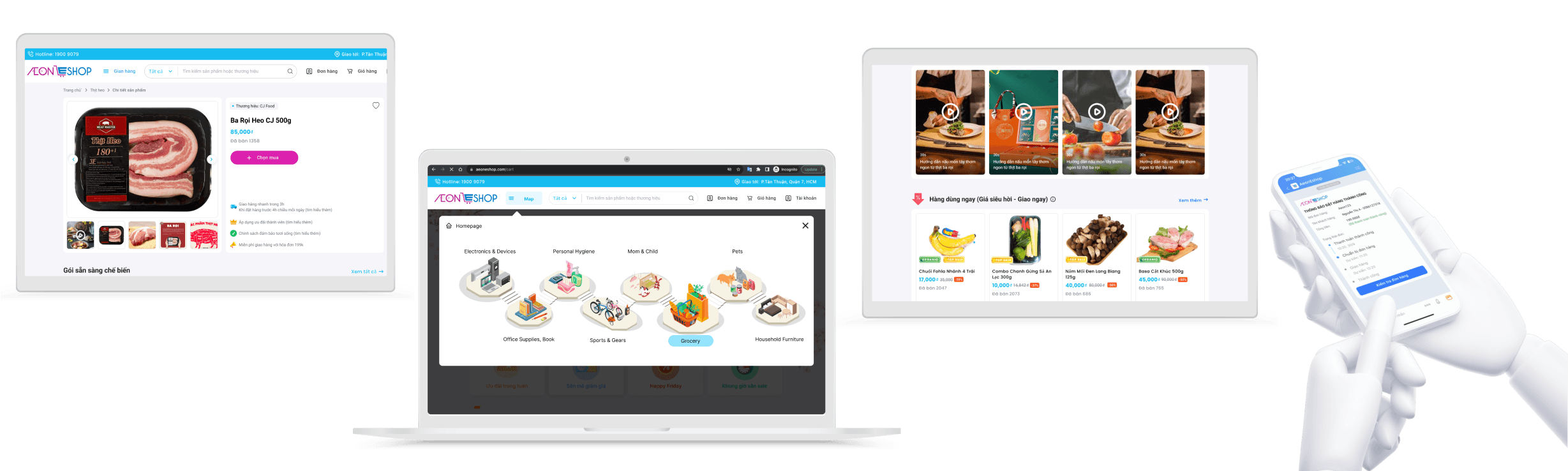
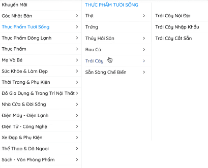
Interactive browsing map promotes new ways to shop for groceries
Insights
AEON has tons of departments, and the list menu seems endless for users to look for certain groceries. This costs time and energy for browsing.
New Designs
Utilizing icons, and illustrations to depict different departments, and categories for users, initiating new and fun experiences.
Accurate delivery estimations for users at all times
Insights
Delivery time is a top priority for many online grocery shoppers. AEON's varying delivery estimates based on customer location and order time can be confusing.
Improvement
Users specify their address upon entry, and the system displays that concise info across different pages.


Special additions for Families - Convenient for Shoppers
Insights
Tested users expressed the need to have catered shopping options to save time. AEON needs new ways to boost sales.
New Designs
Users can purchase family sets and short-dated items to maximize savings of time and money.

Family Meal Set
Enable easy shopping options and new menus for users.
Short-Dated Items
Groceries' freshness is a concern for online shoppers. This separate aisle promotes trusts in users when buying other items.
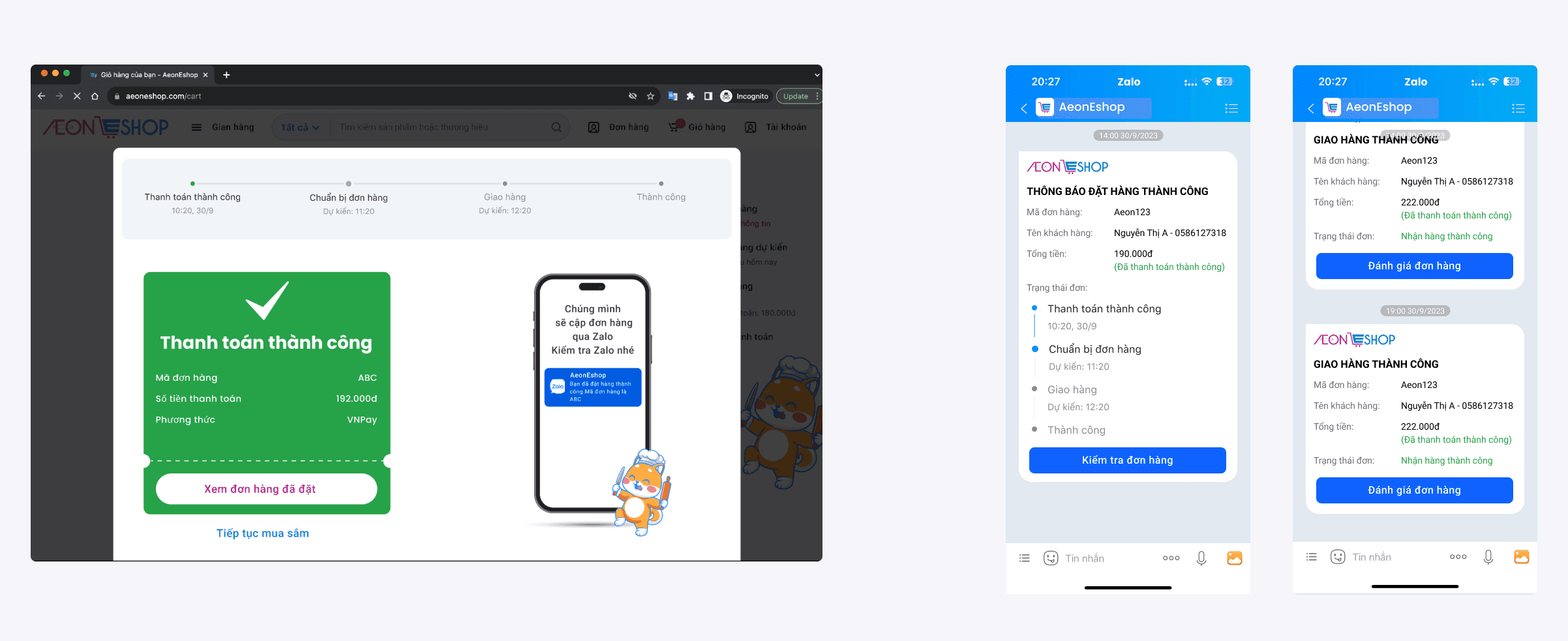
App Integration takes care of Post-Order Experience
Insights
Users shared the needs to check the order frequently, and logging on/off websites may be a hassle
New Designs
Integrating this with the Zalo app, which is largely used by users in Vietnam, allows latest news on the orders.
Many more redesigned elements, check them out!
There are more elements that we're really proud of, but I couldn't include them all in here.
Enjoy our end-to-end purchasing experience with the demonstration video & our Figma clickable prototype.
Figma Prototype
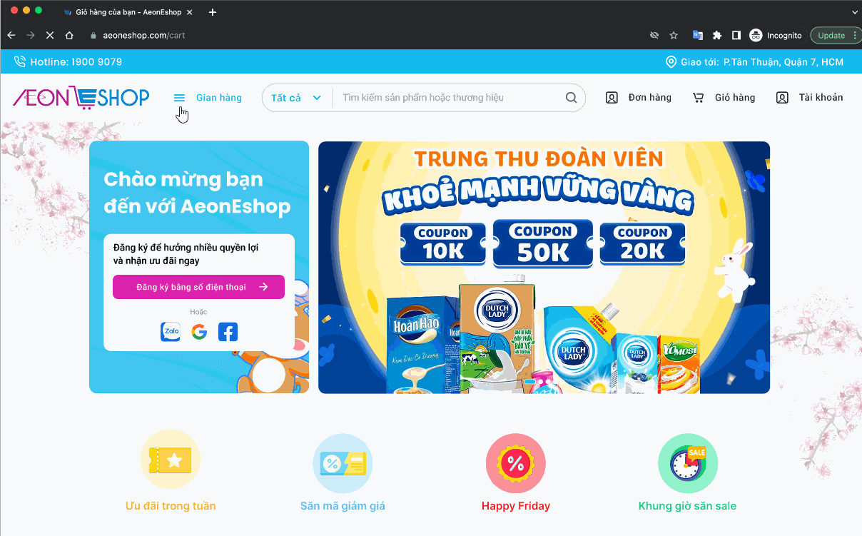
Driving order completion - Decreasing drop-off rate
Current
Users were stuck at certain step and considering dropping the order due to lack of info & clarity
Future
The new flow promotes transparency and seamless transition between many tasks & pages & even platform (web & mobile experiences).
-> This drives completion rates with less shoppers drop off on AEON website.
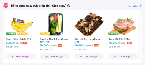
Improving sales for items through diverse selections
Current
General aisle displays and selections make it harder for users to have great findings
Future
The redesign features new options (family meal kits, short-dated item aisle, etc) that provide a shortcut to shopping for users.
Methods: usability testing (4 users)
We took our final stretch before the presentation to gather feedback on our prototype by giving these new users similar shopping tasks.
We took extra notes for future iterations and redid a few immediate designs. We had great feedback from users and classmates!
Below are some main points that our team did not pay attention to when making designs.
UX writing matters
When trying to understand the system at AEON, users were more meticulous with the content of instructions and info.
Visibility of elements matters
Users skipped over a few sections á they were placed way below their main screen.
Nudging users to write reviews isn't easy
Users weren't engaging with writing reviews like we had hope despite the integration with their phone app.
Good Leadership = Empowering your Teammates
Our team members come from different backgrounds, spanning from front-end dev to UI design and even human resources.
As first-time leading a design project like this, I recognized that we overcame the biggest challenge by having team members to proactively contribute and take ownership of certain parts.
This diversity allowed us to learn from one another, make faster progress, and bring in new perspectives.
Designing with Constraints Breeds Creativity
Our team carefully considered the constraints within AEON's current delivery system, optimizing what we can improve from a designer's POV.
We made a valuable trade-off by investing time in verifying AEON's operational processes before finalizing our designs. Thanks to our team members, I learned about different technical constraints from their work experience so that we managed to figure things out the way we intended to! Designing around these constraints, although being harder, helps us come up with the best possible outcomes.

Special thanks to our instructor, TA, and all members
This was one of my most intense projects, mainly because I was in the EST timezone when everyone was in Vietnam. The 12-hour time difference, on top of my teammates’ full-time jobs, created barriers to meeting a couple of nights a week. With my school work, the last few weeks were really the last stretch for the team.
I’m very thankful that everyone stepped up to assist me whenever I needed it. We grew to become friends, bonding over the trauma of the project and supporting one another. Can’t wait to meet and have a coffee with them sometime! 😆
Back to Top